
13 milliseconds.
Fun fact? Yes. BUT — for solopreneurs who are serious about marketing their businesses — it’s also a “must-know” and a “must-not-forget” fact.
Why?
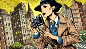
Because every single image you use on your website, your emails, your social media feeds, your sales materials or ANYTHING else that bears the name of your business is telling a story.
And it tells it FAST — which is great if it’s the right story, but not so great if it’s not.
What this means for you as a business owner is that you need to be an expert curator when it comes to choosing images that will be used to represent your business, your products or services, your values, and your purpose.
A Story Sandbox Checklist
Choosing the Right Images that Tell the Right Stories for Your Brand
Identify the main idea you want to convey.
What’s the purpose of the visual? Is it to show how your product can change people’s lives for the better? It is to demonstrate how your product solves a specific problem? Is it to showcase a specific transformation that was achieved by using your product? Know what you want an image to communicate before you go looking for it.
Example: Let’s say you sell grass seed. Instead of featuring an image of a bag of seed or showing someone spreading seed on their lawn, consider using an image that shows a lush green yard that young kids are happily running around on while adults in the background are sitting around talking and enjoying each other’s company.
Understand the emotion you want your audience to feel.
When it comes to the emotional vs. the rationale, it’s all the feels that are typically going to win that contest.
Emotions are powerful drivers of engagement and of decision-making. So, if you’re using an image in your blog post, your website’s hero section, a product listing, an email, or any other type of content — choose wisely.
Ask yourself if the image you select evokes the feelings you want your audience to experience in a natural and relatable way.
Example: If you have a home cleaning service, what’s the pain point you’re alleviating for your customers? For example, if it’s a family with young children, maybe the parents would rather spend their Saturday taking their kids to the park to play instead of spending all day cleaning the house. So, instead of showing an image of one of your employees cleaning, maybe the image you use is one of a kid in a swing. Your headline could be something like, “A cleaning service that makes it easy for you to do you.” Not only is it more emotional, but this approach helps your business stand out from competitors who are using the typical (and ubiquitous) images of someone mopping a floor or cleaning out a refrigerator.
Be inclusive when featuring people.
People relate to other people.
If potential customers don’t see people who look like them in the images you use to promote your business, they’ll look for another business that they believe “gets” them.
Example: If you own a business that sells barbecue equipment — like grills, skewers, cooking utensils, etc. — then you’ll probably want to select images of people using your products. One way would be to use an image of a neighborhood Fourth of July party where people are grilling burgers and hotdogs. But if the only people visible in the image are white, straight, and upper class, you’re going to lose a HUGE percentage of viable customers.
Know your audience and be sure they’re reflected in the images you choose for your business.
Show people being authentically human.
One of my pet peeves is seeing some of the images used to promote various prescription drugs.
Too often, the people shown look way too happy and carefree to be battling whatever condition they have.
It simply doesn’t feel authentic. It doesn’t ring true — at least not to me.
The same is true of stock photos that show people working in an office.
When’s the last time you saw a group of employees gathered around a laptop, laughing and smiling and looking like they’re having the best time EVER??
Again, it doesn’t feel real.
If you’re going to use people in your images, be sure they accurately represent the reality that your audience experiences. Your ideal customer is way too smart to believe anything less.
Example: Let’s go back to the office photo I mentioned a couple of paragraphs back. If you’re an office supply company and want to promote a specific copying machine, don’t show a group of people huddled around it giving each other high fives and smiling like they’re in a toothpaste commercial. Instead, focus on the predominant feature of the machine. Maybe it’s faster than any others on the market. If so, show the copier by itself with NO ONE around it. Your headline could be something like, “This is what an empty printer queue looks like.”
Eliminate clutter.
An image with too many elements can be confusing and overwhelming. It leaves your audience wondering what in the heck is going on.
Avoid images with too many objects or people. Focus on the primary action or subject that conveys your message clearly.
Example:
Imagine you’ve just opened a new coffee shop and you want to create an image for your website’s homepage to attract customers. You decide to include the following elements in one image:
- A barista making coffee
- A group of friends chatting at a table
- A couple enjoying pastries by the window
- A shelf displaying various coffee beans and merchandise
- The shop’s logo and tagline prominently displayed
The image would look something like this:

The Problems
- Too Many Focal Points: There are multiple actions happening at once, making it hard for the viewer to know where to focus.
- Visual Clutter: The image is busy with different objects and people, leading to visual overload.
- Diluted Message: The primary message (e.g., the welcoming atmosphere of the coffee shop) gets lost among the various elements.
How to Fix It
To convey your main message effectively, you need to simplify the image. Here’s how you can do it:
- Choose a Single Focal Point: Decide what the primary focus of the image should be. For example, let’s focus on the barista making a beautifully crafted cup of coffee.
- Eliminate Unnecessary Elements: Remove other distracting elements like the group of friends, the couple, and the shelf display.
- Highlight Key Features: Make sure the remaining elements clearly support the main message.
Once you do these things, then the image would look like this:

Much better, right?? Also, a shout out to DALL-E for helping me create these examples. Awesome sauce!
Avoid using low-res and low-quality images.
Nobody likes looking at images that are out of focus, pixelated, distorted, too dark, too light, etc.
When it comes to images for your business, not only do potential customers dislike crappy photos of your products, employees, or anything else — they also make an instantaneous judgment about you and your brand. And it’s not a positive one.
There are WAY too many options for getting high-quality imagery today. So, no excuses! Also, smartphone cameras are incredibly advanced and can help even the most inexperienced photographers capture some pretty amazing shots.
For stock photography, illustrations and video, here are some of my fave sites:
Before you use stock imagery from any source, be sure you understand the license attached to each image (including video) and adhere to its requirements.
Stay true to your brand's visual identity.
Having so many options for imagery these days is both a blessing and a curse.
The reason is because some business owners treat these options as a veritable all-you-can-eat buffet, piling photos on top of illustrations on top of videos. Then, they sample them on their websites, sales materials, ads, blog posts, etc. to see which ones they like.
This is a HUGE mistake if you’re serious about creating a strong visual identity for your brand.
Pick a visual style and stick with it.
Here are some options:
Minimalist
- Key Features: Clean lines, ample white space, neutral color palette.
- Examples: Apple, Everlane.
- Ideal For: Brands that want to convey simplicity, elegance, and focus.
Bold and Colorful
- Key Features: Bright, vibrant colors, dynamic compositions, playful typography.
- Examples: Google, Buttonwood Park Zoo.
- Ideal For: Brands that want to stand out, appeal to a younger audience, or convey energy and creativity.
Vintage/Retro
- Key Features: Nostalgic elements, muted color palettes, classic fonts.
- Examples: Jack Daniels, Rue Vintage 74 (RV74).
- Ideal For: Brands that want to evoke nostalgia or timelessness.
Modern and Sleek
- Key Features: Futuristic elements, streamlined designs, monochromatic or limited color schemes.
- Examples: Tesla, Lacoste Heritage
- Ideal For: Brands that want to convey innovation, cutting-edge technology, or luxury.
Handcrafted/Artisanal
- Key Features: Hand-drawn illustrations, textured backgrounds, organic shapes.
- Examples: J. Peterman, Shinola
- Ideal For: Brands that focus on handmade products, authenticity, and craftsmanship.
Playful and Whimsical
- Key Features: Fun, quirky illustrations, bright colors, casual typography.
- Examples: Ben & Jerry’s, How Many Plants
- Ideal For: Brands that want to convey fun, creativity, and a light-hearted approach.
Elegant and Luxurious
- Key Features: Rich colors, sophisticated fonts, high-quality imagery.
- Examples: Dior, Rolex
- Ideal For: Brands that want to convey luxury, sophistication, and exclusivity.
Natural and Organic
- Key Features: Earth tones, natural textures, eco-friendly imagery.
- Examples: Whole Foods, Patagonia.
- Ideal For: Brands that focus on sustainability, health, and wellness.
Rebellious
- Key Features: Rough textures, dark colors, utilitarian design.
- Examples: Harley-Davidson, Vans
- Ideal For: Brands that want to convey toughness, durability, and functionality.
Professional and Corporate
- Key Features: Conservative color palette, clean lines, professional fonts.
- Examples: IBM, Deloitte.
- Ideal For: Brands that want to convey reliability, expertise, and professionalism
Friendly and Approachable
- Key Features: Warm colors, inviting imagery, casual fonts.
- Examples: Slack, Mailchimp.
- Ideal For: Brands that want to be seen as accessible, customer-focused, and easy to work with.
Regardless of the visual style you choose to represent your brand, stay consistent. By doing that, you’ll make it easier for your ideal customer to find you in a crowd of competitors.
Here's the Big Picture

Imagine you’re a solopreneur who makes handmade candles and you want to tell a compelling story through your visuals. Here’s how you can apply the principles we’ve discussed to choose (or create) the perfect image:
Identify the Main Idea You Want to Get Across
Start by pinpointing the core message or idea you want to convey with your image. This could be anything from the calming effect of your candles to the cozy atmosphere they create.
- Main Idea: The soothing and cozy ambiance provided by your handmade candles.
Understand the Emotion You Want the Image to Generate
Think about the feelings you want to evoke in your audience. The right emotion will help you connect with your audience on a deeper level.
- Emotion: You want to evoke feelings of relaxation, warmth, and comfort.
Be Inclusive When Showing People
Inclusivity in your visuals helps a broader audience connect with your brand. Make sure to represent diverse individuals who can relate to your product.
- Inclusivity: Feature people of different ages, ethnicities, and backgrounds enjoying your candles.
Show People Being Authentically Human
Authenticity resonates with audiences. Show real, candid moments rather than staged or overly posed scenes.
- Authentic Moments: Capture a family or group of friends gathered around a table, enjoying the soft glow of your candles during a cozy evening.
Eliminate Clutter
Simplicity is key. Focus on the main elements that tell your story effectively without unnecessary distractions.
- Simplicity: The scene should be clean and focused, perhaps with a minimalist or blurred background that highlights the quality and warmth of the candlelight.
Avoid Low-Quality Images
High-quality visuals are essential for maintaining a professional and credible brand image. Ensure your images are sharp, well-lit, and high-resolution.
- High-Quality: Use a professional photographer or high-quality camera to capture clear, bright images that showcase the beauty of your candles.
Stay True to Your Brand’s Visual Identity
Consistency in your visual style helps reinforce your brand identity. Make sure your images align with your overall brand aesthetic and message.
- Brand Identity: If your handmade candle brand is all about natural and eco-friendly products, use earthy tones, natural textures, and simple, elegant compositions.
There you have it! A checklist for choosing the right images that tell the right stories for your brand. It’s not hard — but it is crucial to building a strong, recgonizable visual brand identity that your ideal customer associates ONLY with YOU. Get the picture?